Sector
B2B Financial
Services
- Campaign Development
- Branding
- Logo Development
- Advertising
- Website
- Social
When nationally recognized forensic economics firm, Sobel Tinari came to us for their marketing and advertising needs, we first had to ask, “What the hell is forensic economics?” In short, Sobel Tinari provides economic valuation services to both plaintiff and defense attorneys and does so in a way that makes the firm a standout in their field.
As their agency, Korn Hynes helped to develop new brand messaging, visual identity, and digital/traditional communications vehicles designed to get the firm noticed and raise awareness with its audiences – helping to solidify the firm’s position as the nation’s premier economics firm.
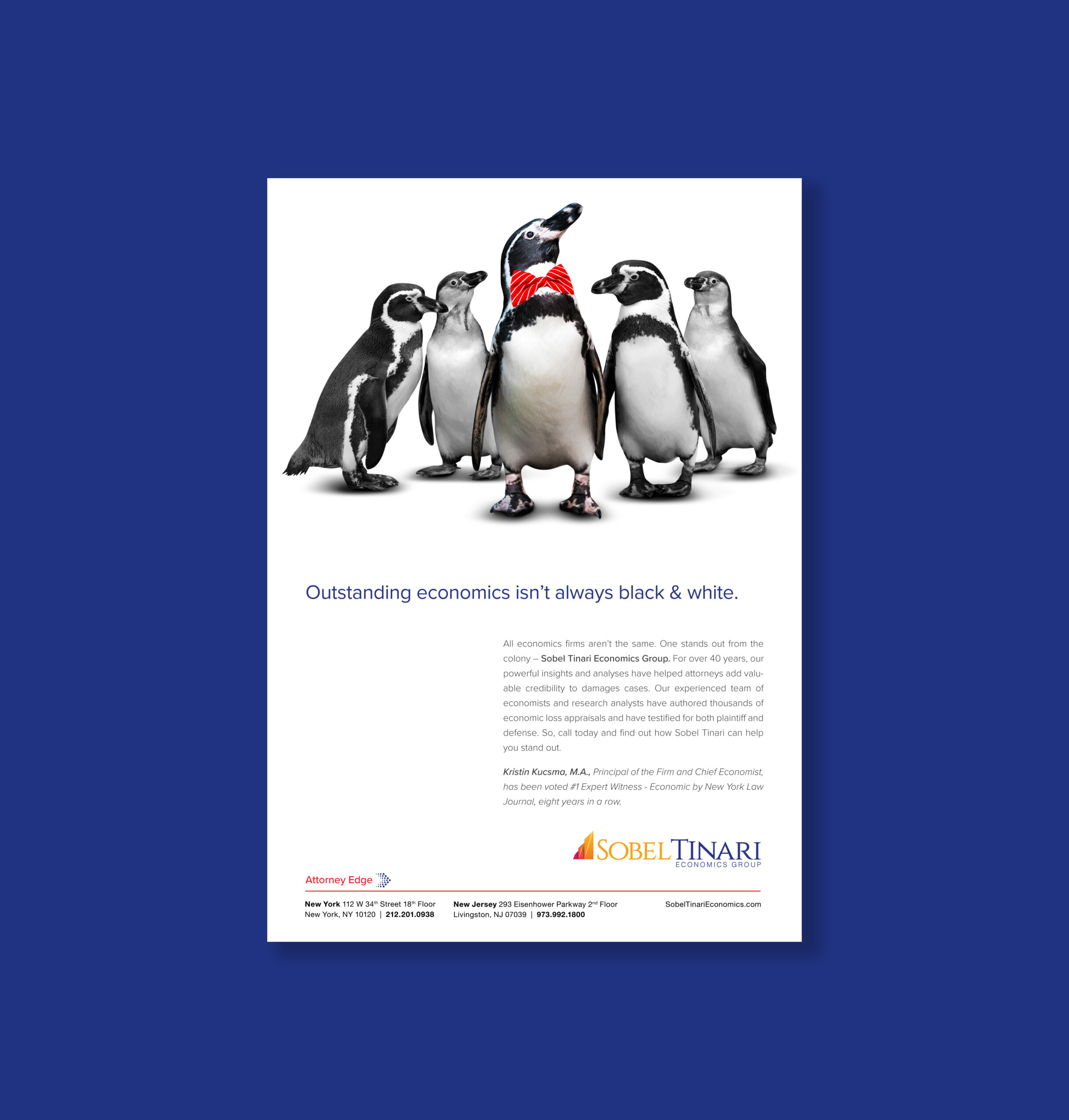
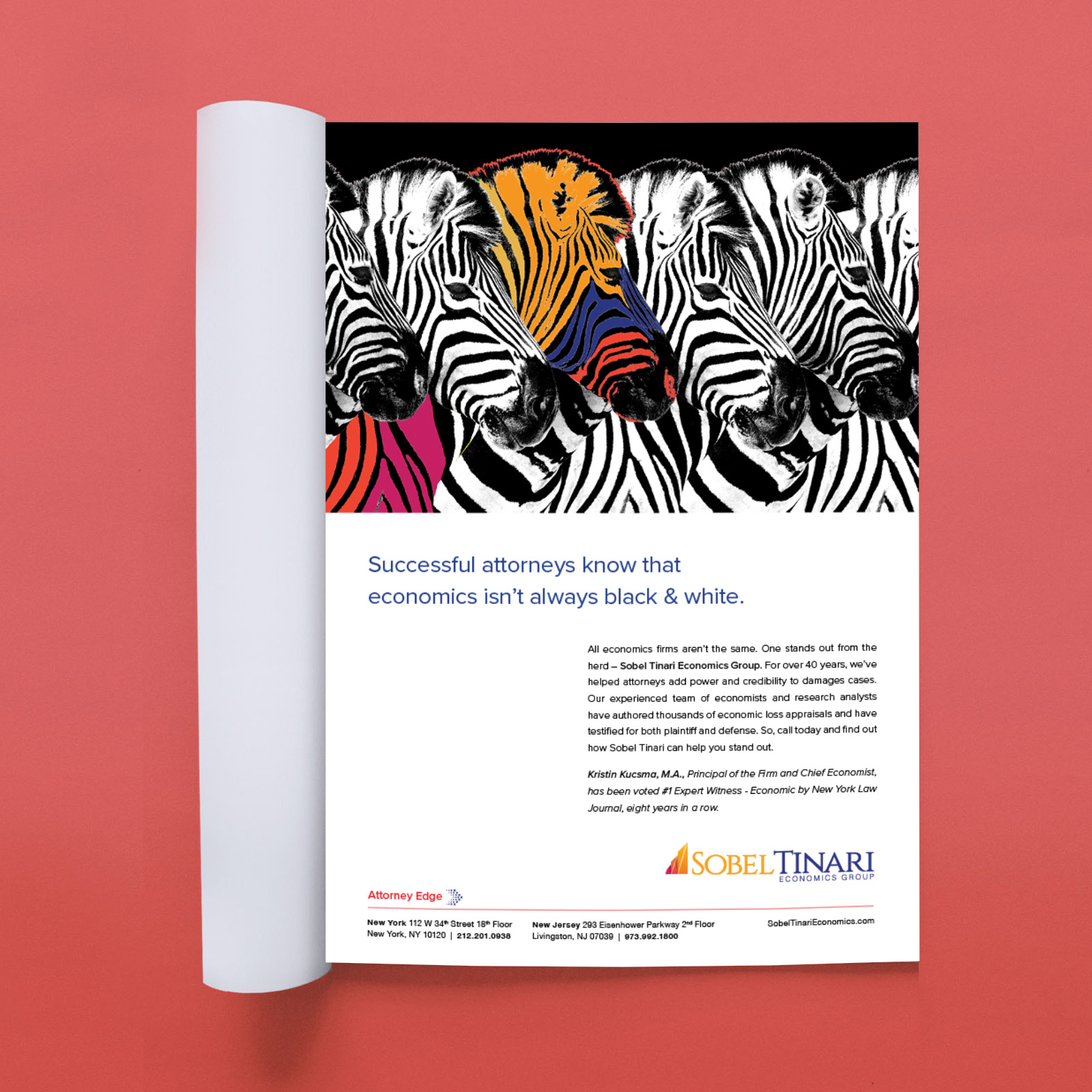
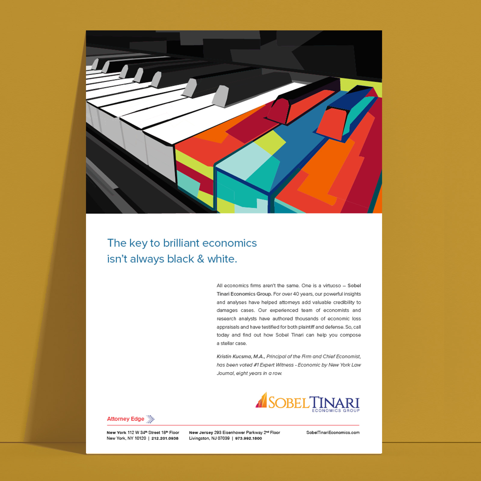
For their latest campaign, we juxtaposed black & white and color to emphasize the bold yet nuanced approach that Sobel Tinari brings to a discipline that’s traditionally known for a black & white approach.

The Sobel Tinari logo needed to be redesigned to reflect the philosophy and personality of the company’s new leadership. The colors were chosen based on color psychology, with blue representing trust and loyalty and orange representing warmth and optimism.
The design of the new icon is a modern interpretation of a graph – a numerical measurement tool used in economics. The icon can also be interpreted as a mountain, representing Sobel Tinari’s strength and towering position in the economics world.